Showing posts with label graphic design. Show all posts

8.28.2011

Hoxeyville Music Festival 2011


I am stoked to write about Hoxeyville Music Festival today, a week after the fun and festivities. I am proud to tell that I was the graphic designer behind their look and feel for this year. The look I designed was used on posters, handbills, the website and web banners, t-shirts (including a custom license plate design) and programs! I was so excited to see people wearing it, carrying it and enjoying the festival.

There was a lot of great great music - Steppin In It, Seth and May, Airborne or Aquatic, Starlight Six, GREENSKY BLUEGRASS, The Itals, Ivan Neville's Dumpstafunk, Ella Riot, Digital Tape Machine, Mickey Hart, and Umphrey's McGee to name a few... With three stages, endless campsites and all that great food and vending, it was hard to see it all. But I managed to see almost all the music. Except Todd Snider, which I am ashamed to say I heard only at my campsite. Even a groupie needs a break. :)

It was bittersweet being there without Benn, the original Hoxeyville gangsta. I thought of him every minute of every hour. I thought about how much we enjoyed seeing music together, and with that thought made it to as many of the shows as possible. It made me feel so happy and normal to watch music. Anyway, the highlight for me after 9 years of attending this festival was witnessing the late night pickin jam with Greensky and Seth and May. There were probably tons of others there that I just couldn't see or hear, but it was so amazing to be there and hear them at their most natural and finest. Super awesome too, because Benn and I always wanted to party with Greensky at Hoxeyville, so in a way I got to, and I danced and smiled and enjoyed every second. For both of us. I thank Jake and Kristin so much for the gift of music.

Whew. So onto the visuals. Here is a mix of posters, handbills, festival photos and whatever else. I love taking photos, more probably for me as a documentation factor. But you know us designers, always trying to get creative with things... anyway I hope you enjoy. I know I did.


2.04.2011

SEO & Why It Pays To Be A Nerd


Its kind of like clipping your toenails or plucking your eyebrows - making sure your SEO is top notch isn't necessarily a fun thing to do, but its a longterm maintenance must. I am not a code poet by any means, nor am I a Google analytics virgin. I reside somewhere in the middle, doing my own SEO when I remember, or when I notice someone else is getting business that I should have gotten. Either way I realized know a bit more about it than most people so I wanted to just share some perspective on what I have learned the past few days (and years).

As a designer, its a pretty big value add to my skills to know and use this info. Learning how to plan your design for SEO is huge and can mean a huge difference to your clients. Knowing when and where to use large images, flash or other load-time heavy or unsearchable elements can save you a lot of time and headache.

Geographic Tags

Today I perused my various - and by various I mean cascading list of portfolio sites, blog, facebook fan page, Etsy store... and took stock as I added more regionally targeted tags and keywords. I am in Northern Michigan and let me tell you that the freelance market doesn't get much more cutthroat than here. I live outside a Michigan town of about 12,000 people that are all trying to make it work however they can in this economy. It is of utmost importance to have location tags and meta data where you can get it. Because someone else probably does, unwittingly no doubt, and they will get business because of it.

Consistent Names and Information

As I went through as many of my sites as I could remember passwords for... I noticed a major inconsistency. Half of my stuff used "Dani" and the other half, the more professional half used "Danielle." I looked into it, and decided that I need to use Danielle across the board, because my AIGA membership, most of my business registration information (and more) are listed under Danielle. Whoops. So I changed the pertinent ones, and those will start to get crawled and re-cashed by Google tonight. So lesson learned here is that yes its helpful to be available in many places on the internet, but it can be harmful if your information isn't consistent across all communications. Seems like a no-brainer now.

Text, Tagging, Keywords

There are some rules about SEO that aren't meant to be broken. For instance having most of your content as searchable HTML is crucial, tagging things appropriately, and creating a consistent flow of fresh, relevant content. There are certain things that will get you black listed by Google, such as hidden HTML or tags, directing links to yourself and keyword stuffing.

Titleing your site is probably the easiest way to be found. Title it with relevant info. Mine says "Danielle Gudowski | Northern Michigan Graphic Designer." This title gives a lot of pertinent info to Google, or potential customers.

I tag all my projects, web pages, anything I can using the same idea. I use keywords about my skills, the name of my profession, my location and info about the project or topic. This blog tags SEO, Google, graphic design, web design... You get the picture.

I also indexed my site with Google. Its a simple thing to do just in case.

Flash Flash Flash

This seems like almost out dated to talk about, but maybe I have just been making websites a long time. Flash and images aren't great things to have on your website unless you have a way of making the information searchable. They are awesome and I personally think flash does amazing, rich interactive but the name of the game is visibility. And new content.

But I want it all.

I am a graphic designer, which means I want the stuff to be pretty AND functional. I don't want a site that is all hyperlink text. Ugly. I want a beautiful interface with well designed typefaces that doesn't take forever to load or get penalized on Google for having awesome eye-catching visuals. Sometimes it can seem like design may get in the way of SEO. Not true. There are many awesome tools to help you get away from the Craigslist look. (I would like to note here that I know that the founder of Craigslist deliberately designed the site the way it is. It doesn't mean its not ugly. Unless you are suggesting that functionality in its self can be beauty... which would be very wabi-sabi of you...)

Typekit is a website that for a price gives access to code and typefaces that you can substitute with a flick of the ol' code finger. No longer are we bound by the 5 web fonts. (Or are there 7...) There was a way to use code and each individual letter to build custom type, but that just increases load time.

Before finding tools to help you, think about being a good planner, which is really what it means to be a good designer. If you can plan your web site with SEO in mind from the get-go making an optimized site can be a real breeze. I opt for this, but its nice that there are things out there like Typekit.

As mentioned I am no SEO expert, just sharing what I have learned. Please share what you have learned in the comments! Keep webinating.

12.20.2010

New Work: Rex Renwick & Sons Forest Products Logo


There are a lot of logging and forestry companies up here in Northern Michigan, but not quite so many are synonymous with quality, honesty and hard work as Rex Renwick & Sons. The company was in need of a fresh logo for use on upcoming marketing strategies including a website, new business cards and t-shirts. Their business has two facets—they haul logs which (trucking aspect of the business) and they produce and harvest logs with heavy machinery (forest products side).

After a couple of rounds of logos, they chose the logo here that focuses on the R of Renwick and the name, rather than imagery of trees, forests, or machinery. The dominant R is very much a reflection of the simplicity and honesty you get when working with Rex and his company. While searching for an appropriate typeface, I came up with this description of what I needed:

"Looking for a font that's manly but not too modern; western but simple; John Wayne meets Jack White kind of feeling but not too rock n' roll..."


Sometimes the path of the deisgner forces us to articulate our vision in very descriptive ways. Anyway that analogy up there pretty much describes what kind of person Rex is, what kind of business they run, and where they run it. We needed the logo to be simple, strong, convey an "up north and approchable" kind of vibe, all while keeping in mind that Rex needed a "John Wayne" look and feel. That was his wife Deb's description :)

I look forward to screen printing t-shirts, making them new business cards and creating a web presence for them in the upcoming months.

11.10.2010

Inspired by... everything.


I did a photo shoot today of some books I have made the last week or so. These are some of my favorite shots. I like taking photos of my crafts almost as much as making them! I have been on a kick making things that are very fall looking, some things very HUNTER looking... In Northern Michigan, opening day of gun hunting season is next Monday. There inevitably are always dudes in trucks wearing ridiculous hunters orange garb. I am a product of my environment. I embrace this.

10.12.2010

Stefan Sagmeister at CCS in November

Just got my CCS alumni newsletter in the mail, and it looks like Stefan Sagmeister will be doing a lecture at CCS in November! I think I will have to grab my Behance Dot Grid Book, my sharpie pen, and head on down to the WB Ford Building. Who's coming with me? Check him out here: http://www.ted.com/talks/stefan_sagmeister_shares_happy_design.html

9.07.2010

Things I thought were winners...


But my clients maybe didn't. Well, that wasn't always the circumstance sending these recent works to their archival folder in the sky. This is their one chance to see the light of your LED, but if only for a moment. Goodnight sweet posters, goodnight.

Top: Poster and postcard that almost got through for the September 9 West Michigan AIGA Chapter lecture this week.

Bottom: A poster I sent to Greensky as a 420 gift.

6.27.2010

I love printing things.


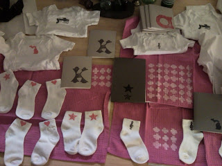
Last night I made a couple new stamps, okay FIVE... and went to town on some new onsies I got. They came in all these cute colors, and I just went for vibrant, fun, with a touch of retro. These will be available in my new etsy site soon: charmellow.etsy.com. I will also be selling at the Hoxeyville Music Festival this August.

6.14.2010

AIGA Postcard


The Colorado AIGA participated in a HOW Lounge at the HOW Conference last week in Denver. They sent out a call for submissions for a postcard packet from Denver's finest AIGA members. The theme was to show Denver's pioneering spirit on the postcard. I chose an info graphic to represent my thoughts. Not sure if it was chosen for the postcard pack or not yet, but I thought I'd share!

6.11.2010

New Work


These logos were presented to T4 Group out of west Michigan. They went with the last letterform shown as the basis for their design. I have included my sketches to show some process.

5.26.2010

Shiney and New


Yesterday I made some mini portfolio's to take with me to Michigan. It ain't no joke being a hustler. Its hard on the streets, which is why I finally got off my rear and took a hold of my future. So here is my latest rendition of "The Teaser."

For those of you that don't know about what the teaser is, get your life together. No just kidding that was harsh, but honestly some people don't know that designers have to take these extreme, time consuming measures to get noticed by potential employers. Everyone can send an email, but not everyone can hand bind a book.

Anyway these things are usually a long work in progress, so leave your comments!

*I just want to note that the Detroit Tigers stamp was hand crafted by Nick Gudowski. (big ups)

4.11.2010

Craftiness Abounds


Here is a sneak peek at the inventory I have been building for the launch of my new etsy store and design studio. Today I will be constructing tags, packaging and taking photos of all these lovely goodies. Vive la DIY revolution!!!

4.09.2010

Some New Designs...


I designed these spreads for the Dallas Official Visitors Guide, coming out in a couple of months. *Excuse the low res images... its only at the first round :) Shoe laces courtesy of Chris Gregori.